Dog Rescue Website Redesign
How my team and I redesigned the website for The Animal Pad a volunteer run dog rescue in San Diego. Our goal was to redesign their website to make it easier for people to foster, adopt, and donate.
Tools
Figma
Figma Slides
Fig Jam
Notion
My Role
UI/UX Designer
Project Manager
3 Person Team
Scope
This project involved redesigning The Animal Pad’s existing website to deliver a more modern and visually engaging user experience. The work focused on improving site navigation, enhancing content presentation, and optimizing usability across devices. The goal was to create a refreshed platform that better supports the rescue’s mission, community, and adoption workflows.
Timeline (3 Weeks)
Week 1: Interviews, surveys, and research synthesis
Week 2: Feature prioritization, low and mid fidelity prototypes, usability testing
Week 3: High fidelity prototype, final testing, documentation, and presentation
Deliverables
• User research findings
• Problem statements and hypotheses
• User flows and journey maps
• Clickable prototype
• Usability testing results
• Personas and scenarios
• High fidelity Wireframes
• Additional design artifacts
CHALLENGE
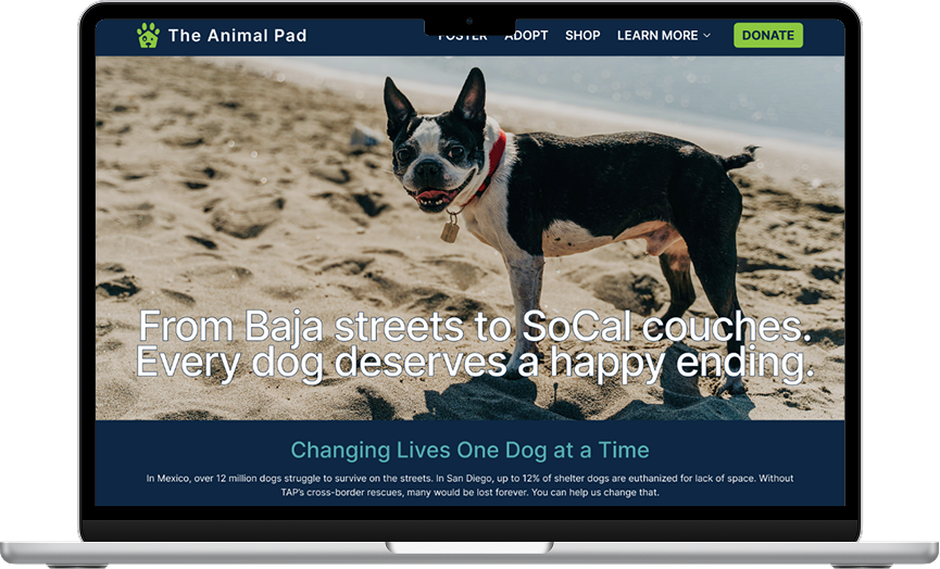
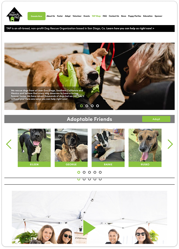
The Animal Pad’s website needed a modern redesign that made it easier for people to foster, adopt, and donate. Users were motivated to help, but the site’s outdated layout, unclear navigation, and scattered information created barriers that affected the rescue’s mission and user engagement.
THE SOLUTION
We redesigned The Animal Pad website with a clearer navigation structure, improved content presentation, and a modern, trustworthy visual design. By simplifying pathways for fostering, adopting, and donating, we created a streamlined experience that helps users take action quickly and confidently across all devices.
PROBLEM STATEMENT
Users who want to foster, adopt, or donate struggle to complete their goals because key information is difficult to find, navigation is confusing, and the overall experience does not build trust. These usability issues prevent motivated users from taking action and limit The Animal Pad’s ability to support more dogs.
Design Process
Our team used the double diamond design process to finish this project.
Research 🔎
Heuristic Evaluation of current site
2 Stakeholder Interviews
6 User interviews with light usability testing
Affinity Mapping
Competitive Analysis
Feature/Element Comparison
Design 🎨
Mid Fi Wireframes
Mood Board and Style Guide
Hi-Fi Wireframes
Clickable Prototype
Synthesize 🧩
Affinity Mapping
2 User Proto Personas
User Journey Map
Test ✔️
2 Rounds of Usability Testing
Stakeholder Presentation
Handoff including research report and design files
Ideate 💡
User Flow
Updated Site Map
Sketches
User Interviews
I conducted six remote user interviews with individuals who had experience adopting or fostering dogs, as well as supporters of animal charities in general. These sessions were held over Zoom and Google Meet during the first week of the project.
Each interview followed a structured script and began with general questions about the participant’s past adoption or fostering experiences. Participants were then asked to navigate the current website while sharing their impressions, pain points, and expectations. All sessions were recorded, documented, and synthesized into a shared FigJam file for team analysis.
Stakeholder Interviews
We interviewed the organization’s CEO and their second-in-command, using a prepared list of focused questions to guide the conversation.
Through this conversation, we learned that the rescue had strong, unique content and a highly engaged Instagram presence. However, their website did not reflect their strengths, and the outdated layout limited user trust, clarity, and conversion opportunities.
Competitive Analysis
I compared The Animal Pad to Best Friends Animal Society and World Wildlife Fund (WWF) because both are well established, mission driven organizations with strong credibility and a proven ability to engage supporters online.
KEY PATTERNS
Across both competitor sites, several consistent design patterns stood out:
Emotional storytelling using high quality photos, videos, and rescue narratives
Clear, intuitive navigation that helps users quickly locate adoption info, donation options, or educational content
Multimedia elements that highlight impact and keep users engaged
WHAT THIS REVEALED
Compared to these sites, The Animal Pad relied heavily on text and offered limited interactivity. Their strongest content lived on Instagram instead of the website, creating an inconsistent experience for users.
This analysis surfaced clear opportunities, including:
Bringing their unique rescue work forward through visual storytelling
Simplifying and reorganizing the navigation structure
Adding engaging multimedia elements to build trust and increase conversions such as adoptions and donations
Affinity Mapping-What did we hear from users?
KEY TAKEAWAYS
Navigation is confusing - Users couldn’t always tell where to find foster/adopt information
Donation trust is low - No visible security badges, testimonials, or impact statements
Content is overwhelming - Adoption/foster pages are text-heavy and intimidating
Community offerings are hidden - Puppy parties, events, and volunteer opportunities aren’t promoted clearly
Users want reassurance - Both adopters and donors want transparency about the process and the impact of their actions
Proto-Personas
Alex – “The Thoughtful Rescuer”
What This Means for the Design
Provide comprehensive, transparent dog profiles with clear behavior notes, needs, history, and compatibility details
Offer easy tools to search, filter, and compare dogs, helping analytical users make informed decisions
Surface key expectations early, such as timelines, requirements, and support available during fostering or adoption
Reduce uncertainty with step by step guides, visual timelines, and clear explanations of the application process
Blend emotional storytelling (photos, videos, personality highlights) with practical details to appeal to both emotional and analytical decision-making styles
Ensure navigation is simple and intuitive, reducing any overwhelm that might deter the user
Jamie – “The Purpose Driven Giver”
What This Means for the Design
Highlight trust building elements such as clear impact statements, security badges, and transparent donation breakdowns
Bring emotional storytelling forward with real rescue stories, photos, and short videos
Present tangible proof of impact at key moments in the donation flow so Jamie sees where her contribution is going
Keep the donation process simple, fast, and guided, reducing confusion or friction
Add ways for donors to stay connected, such as follow-up updates, newsletters, or “impact snapshots”
Avoid long walls of text. Use clean layouts and bite-sized messaging that reinforces clarity and trust
Information Architecture- Streamlining the User Flow
The revised sitemap organizes The Animal Pad website into clear, user friendly sections Adopt, Foster, Learn More, Shop, and Donate each with streamlined subpages for easier navigation
New additions like Community Events, Puppy Parties, and a Photo Gallery enhance engagement, while simplified donation and adoption flows improve accessibility and encourage user action
Mid Fi Wireframes-Early Design Concepts
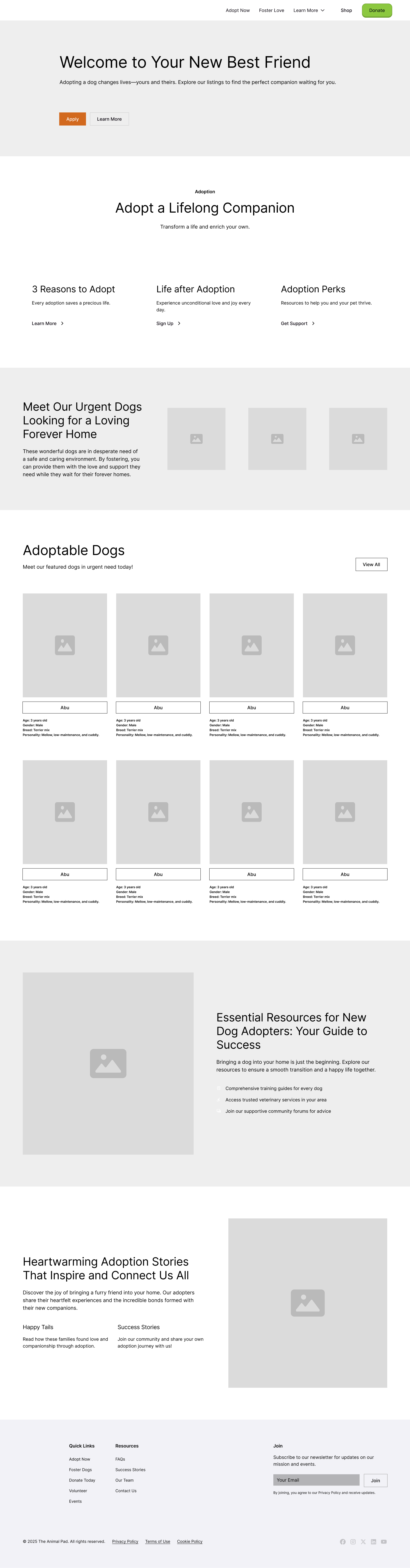
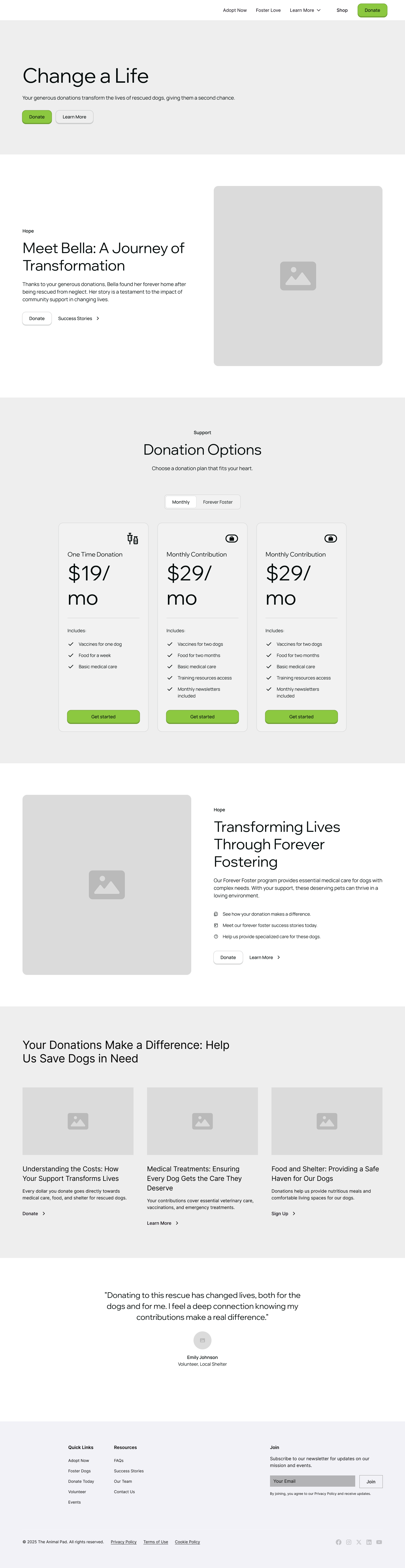
Clickable Prototype
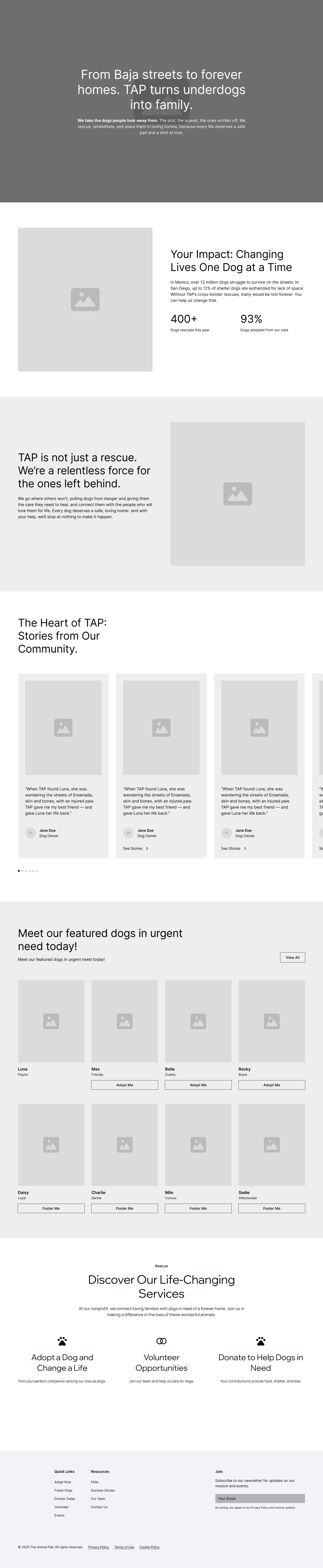
Homepage Redesign
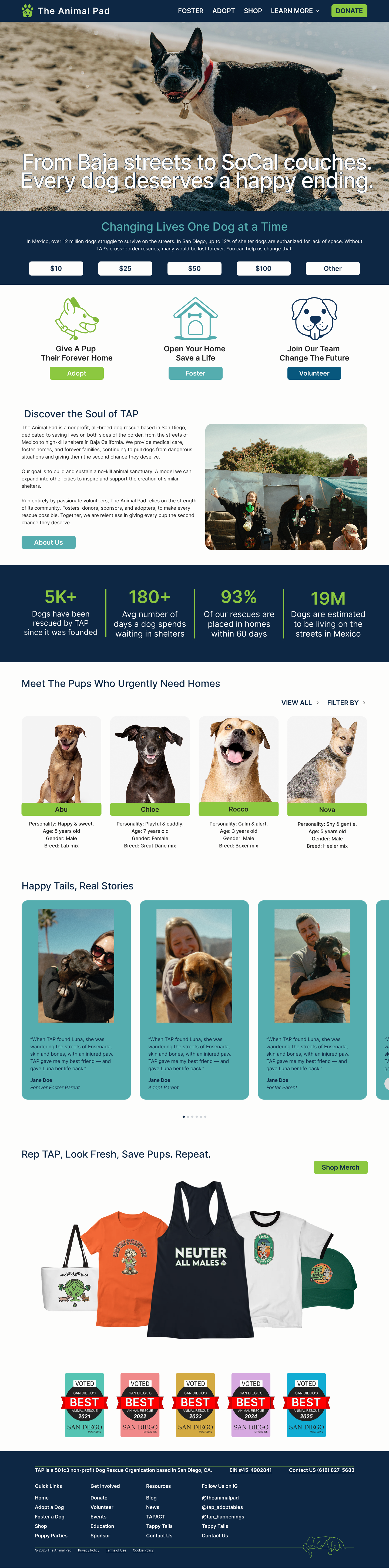
Simplified and Clarified Navigation
Stronger Hero Section with Clear Messaging
Clear Primary User Paths
Adoption Redesign
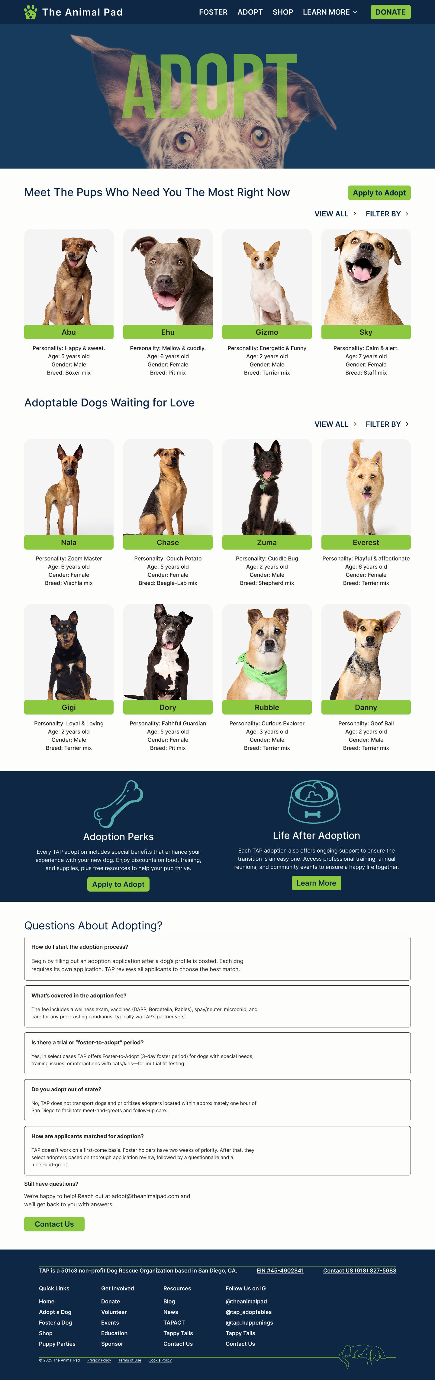
Cleaner, Scannable Dog Listings
Clearer Visual Hierarchy
Stronger Calls to Action
Donation Redesign
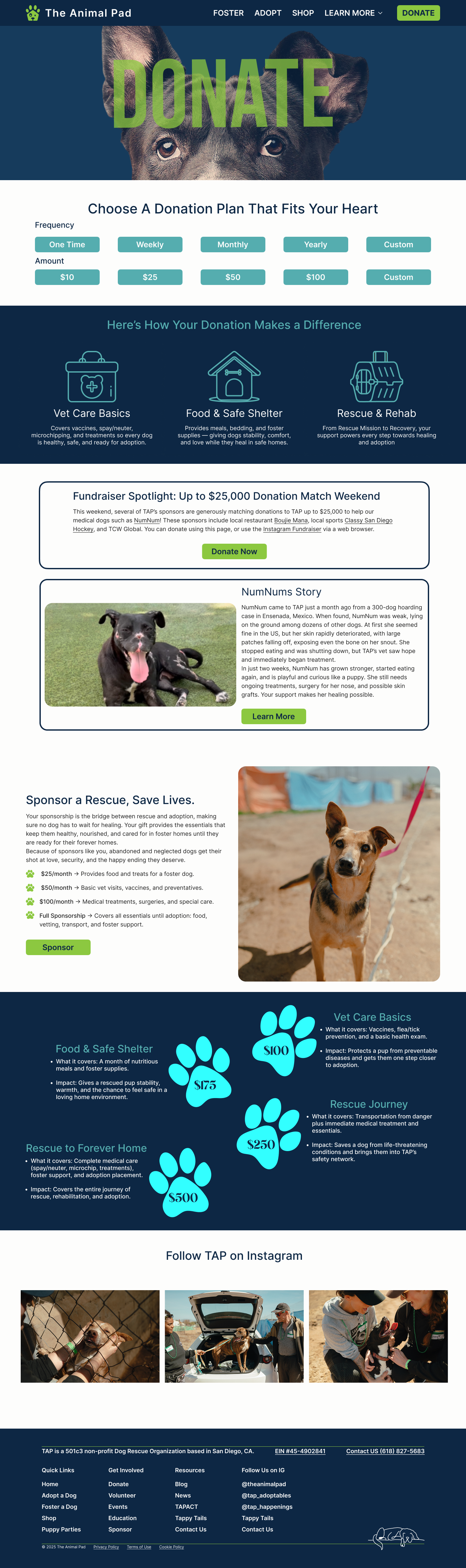
Simplified the Donation Flow
Clearer Impact Communication
Improved Visual Hierarchy and Focus
Usability Testing
Task: Find a Dog to Foster
Before: 60% success, average time 2:10 mins
After: 100% success, average time 1:05 mins
+40% increase in completions, ~50% faster
Task: Make a Donation
Before: 40% success, average time 1:45 mins
After: 90% success, average time 0:50 secs
+50% increase in completions, ~52% faster
Task: Start Adoption Application
Before: 50% success, average time 3:20 mins
After: 100% success, average time 1:40 mins
+50% increase in completions, ~49% faster
Implementation/Metrics
Donation Conversion Rate-Measure % of visitors who complete a donation after landing on the Donate page.
Recurring Donations-Track sign ups for monthly giving as a key sustainability metric.
Application Completion-Monitor foster and adoption application completion rates vs. drop-offs.
Time on Task-Measure time to locate Adopt/Foster/Donate flows compared to baseline tests.
Event Sign Ups-Track number of RSVPs for community events like puppy parties and volunteer opportunities.
User Feedback Loop-Implement short post-action surveys (“Was anything confusing today?”) to continuously capture insights.
Handoff
This project proved the impact of thoughtful UX design on a nonprofit mission. By simplifying navigation, clarifying foster and adoption steps, and adding transparency to donations, we created an experience that makes it easier for users to take meaningful action helping more dogs find homes and more donors feel confident in their giving.
We handed off an annotated Figma file with a reusable component system and recommended WIX as a practical platform for launch, allowing The Animal Pad team to implement changes quickly without heavy technical support.
Key lessons learned included the importance of balancing emotional storytelling with usability, and how small details like progress indicators, impact tiers, and clear volunteer roles can significantly reduce user hesitation. Going forward, I would focus on high-fidelity branding, A/B testing donation flows, and expanding the Community Hub to build long-term engagement.


Meet the Pups Behind the Project!