
New Feature for a Mobile App
From a simple music identification tool to a community driven discovery platform.
At a Glance
Entertainment Industry
Tools
Figma
Figma Slides
Fig Jam
Notion
My Role
UI/UX Designer
Researcher
3 Person Team
Scope
I worked on a team project to redesign Shazam. While Shazam dominates the market for music identification, users typically open the app, tag a song, and leave immediately. Our challenge was to design new features that would encourage users to spend more time on the app and return more often.
Timeline (3 Weeks)
Week 1: Interviews, surveys, and research synthesis
Week 2: Feature prioritization, low and mid fidelity prototypes, usability testing
Week 3: High fidelity prototype, final testing, documentation, and presentation
CHALLENGE
Despite Shazam’s popularity, its engagement problem was clear. Users consistently described the app as a tool, not a place to explore. After identifying a song, they quickly closed it and moved on to platforms like Spotify or Apple Music.
PROBLEM STATEMENT
The main pain points we uncovered were: users were unaware of features like charts or playlists, saved songs were often forgotten, and no community or personalization kept people coming back.This led to our guiding question, how might we create an experience that turns Shazam from a one-time utility into a platform users want to explore and revisit?
Design Process
Our team used the double diamond design process to finish this project.
Research 🔎
Competitive Analysis of Shazams current competition
Feature analysis of community apps
Competitive Matrix
6 User interviews with light usability testing
Design 🎨
Mid Fi Wireframes
Mood Board and Style Guide
Hi-Fi Wireframes
Clickable Prototype
Synthesize 🧩
Affinity Mapping
User Proto Personas
User Journey Map
Test ✔️
2 Rounds of Usability Testing
Stakeholder Presentation
Future Concept
Ideate 💡
User Flow
Updated
Information ArchitectureSketches
User Interviews/Affinity Mapping-What did we hear from users?
To better understand user behaviors and needs, I conducted a series of user interviews with participants who regularly use Shazam.
A consistent theme emerged: users saw Shazam as a one-and-done utility.
Most opened the app, tagged a track, and left immediately often forgetting about their saved songs.
Some were unaware of existing features like charts or playlists, while others expressed interest in more social and personalized tools.
These insights became the foundation for identifying opportunities to extend engagement and build features that aligned with real user expectations.
“I didn’t even know Shazam had playlists or charts. I thought it was just for tagging songs”
“Sometimes I save songs in Shazam, but I forget to go back and listen to them later”
“I use Shazam for a few seconds, but then I go straight to Spotify to actually listen”
Competitive Analysis
Our competitive analysis revealed that while apps like Spotify and Apple Music excel at community and personalized recommendations, Shazam lacked these elements highlighting a clear opportunity to bridge the gap between quick discovery and long term engagement.
Proto-Persona
Melina – “The Social Music Explorer”
What This Means for the Design
Enable fast low friction music discovery that does not interrupt listening
Support passive social sharing rather than manual or forced actions
Surf friends music activity in a lightweight, glanceable way
Treat music as identity and self expression, not just a utility
Make revisiting past Shazams feel engaging and meaningful
Provide simple insights into listening history and trends over time
Moscow Matrix-Prioritizing Important Features
Organized ideas using a MoSCoW matrix (Must, Should, Could, Won’t) to identify which features would have the most impact.
Must haves included auto saving Shazamed songs, user profiles, playlists, and stronger social interaction features.
Should haves focused on expanding community and engagement tools like direct messaging, group sharing, and trending song insights.
Could haves explored personalization and mood-based experiences to deepen user connection.
Won’t haves helped refine scope by removing features that were too complex or unrelated to the project’s main goal of increasing user engagement
User Flows
We designed three core flows to demonstrate how these features increase engagement:
Community Feed-Users see what friends are listening to, like or comment, and follow playlists, Shazam becomes a social hub
Personal Insights-A dashboard highlights top artists, recent discoveries, and trends, users revisit regularly for new stats.
Discovery Playlists-Each Shazam triggers contextually related playlists, encouraging exploration instead of quick exits
Together these flows extended the user’s time in the app and created reasons to return.
Sketches-Early Design Concepts
We started with sketches to explore different layouts for community and insights features. Mid-fidelity wireframes helped us test navigation clarity and content hierarchy.
Clickable Prototype
Music Identification Redesign
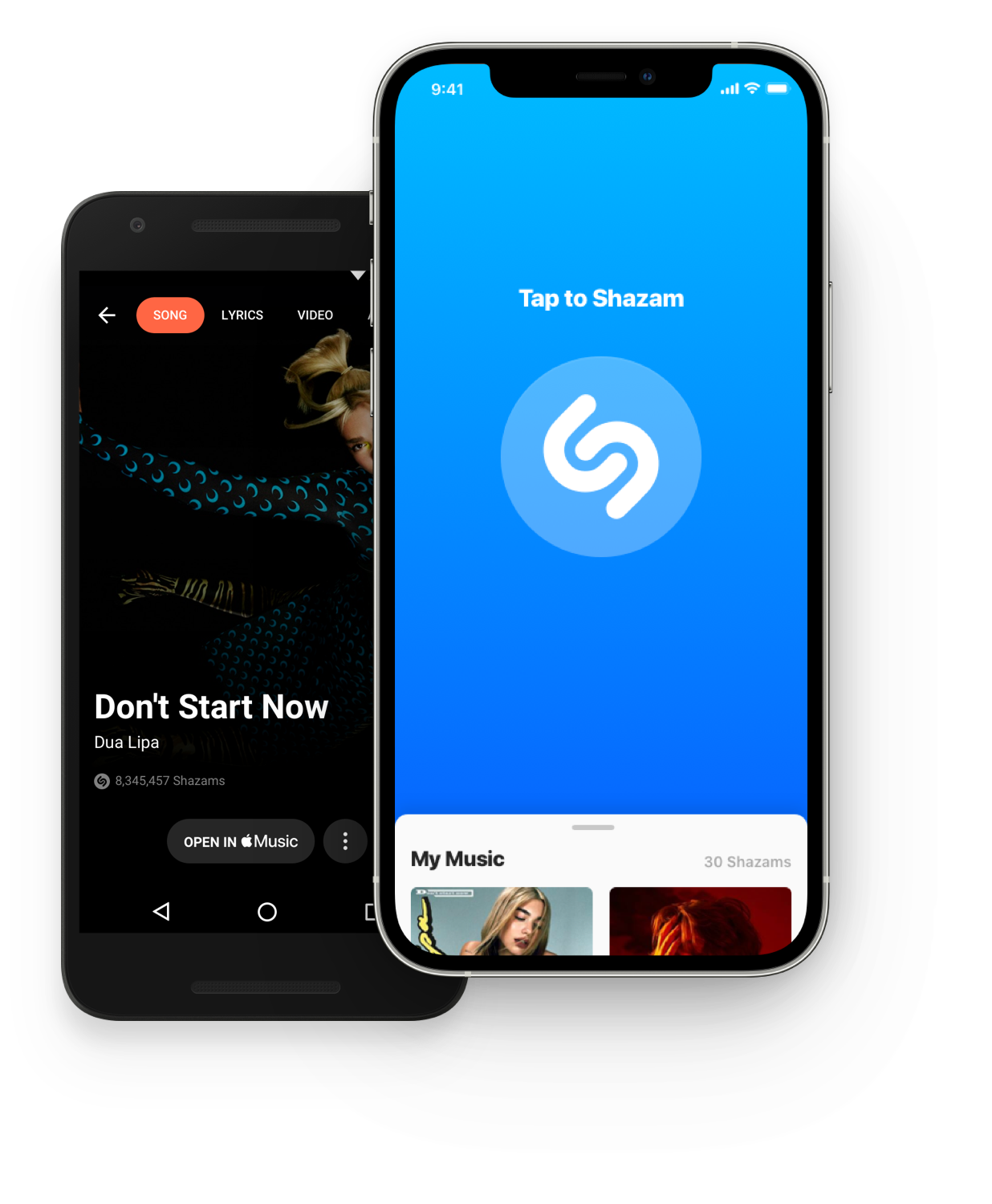

Core music identification remains the same
Personalized Playlists
Updated Navigation Bar
Adding a Friend Feature
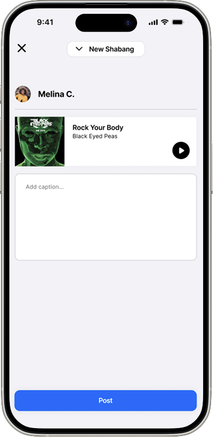
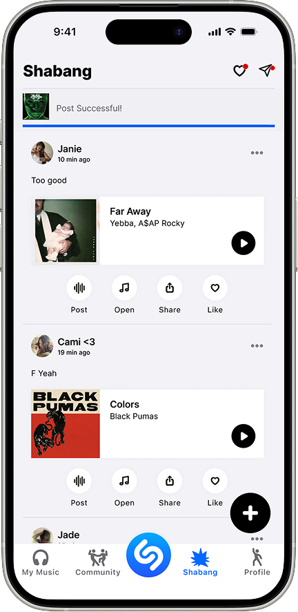
Post instantly after Shazam identifies the song
Caption and share to in app feed
Friends can like and comment in Shazam
Adding a Community Feature
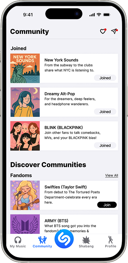
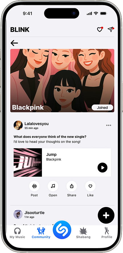
Join groups based on fandoms, genre, or location
Browse/search and tap to “Join”
Inside post, ready, comment
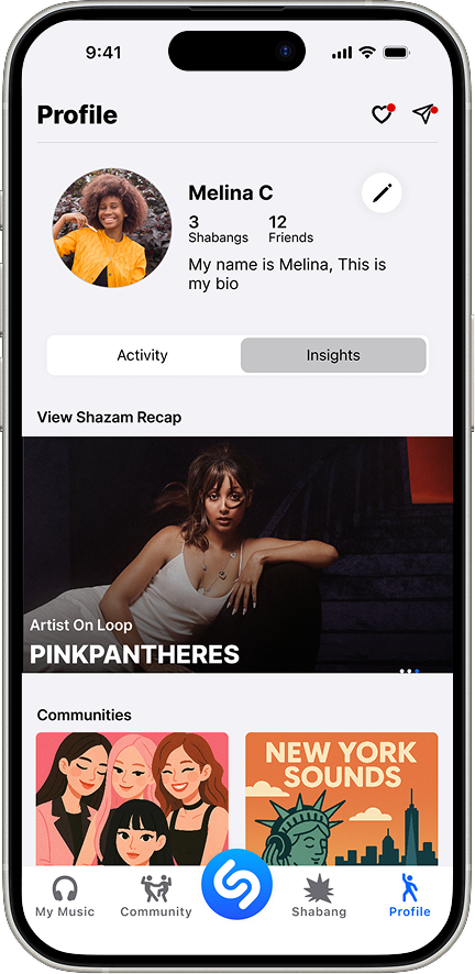
Adding a Profile Page with Personalised Insights
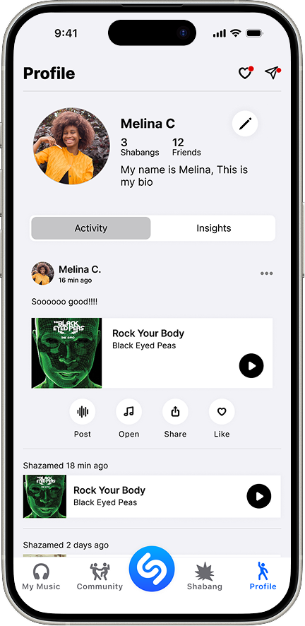
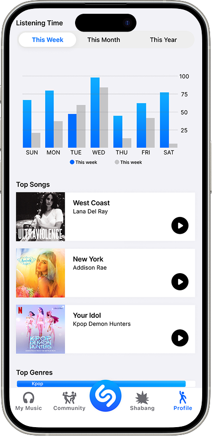
Track you top songs, genres, and listing stats to reflect you evolving taste
Explore personalized recommendations based on your Shazams and habits
View your joined communities and revisit key moments in your music journey
Usability Testing
Task success improved from 60% to 100% after hi fi refinements
Ease of use increased to 5/5, with users describing the flow as effortless and intuitive
Perceived professionalism and trust improved from 4/5 to 5/5 through visual polish
Confusion dropped significantly, from 3.4/5 to 5/5, eliminating hesitation during key tasks
Key Insight
Creating a Shabang post, the primary social action, became clear and intuitive after improving button placement and labels
All users cited Insights as their favorite feature and said it would make them use Shazam more frequently
Design Outcome
Clearer UI and refined visuals increased credibility and confidence
Iteration directly addressed usability gaps identified in mid fi testing
Final design validated as intuitive, frustration free, and engaging
Measuring Success in the Future
If launched, we would track success through the HEART framework:
Average session length – Did users stay longer per visit?
Weekly active users – Were they returning more often?
Community engagement – Likes, comments, and follows.
Playlist exploration – Click-through rates on curated content.
Saved music revisits – Increases in users replaying tagged songs.
These metrics would show whether Shazam successfully evolved into a more engaging platform.