E-Commerce Website Redesign
Redesigning a mystical e-commerce experience to improve usability, clarity, and trust while keeping the magic intact
Tools
Figma
Figma Slides
Fig Jam
Notion
My Role
UI/UX Designer
Project Manager
Scope
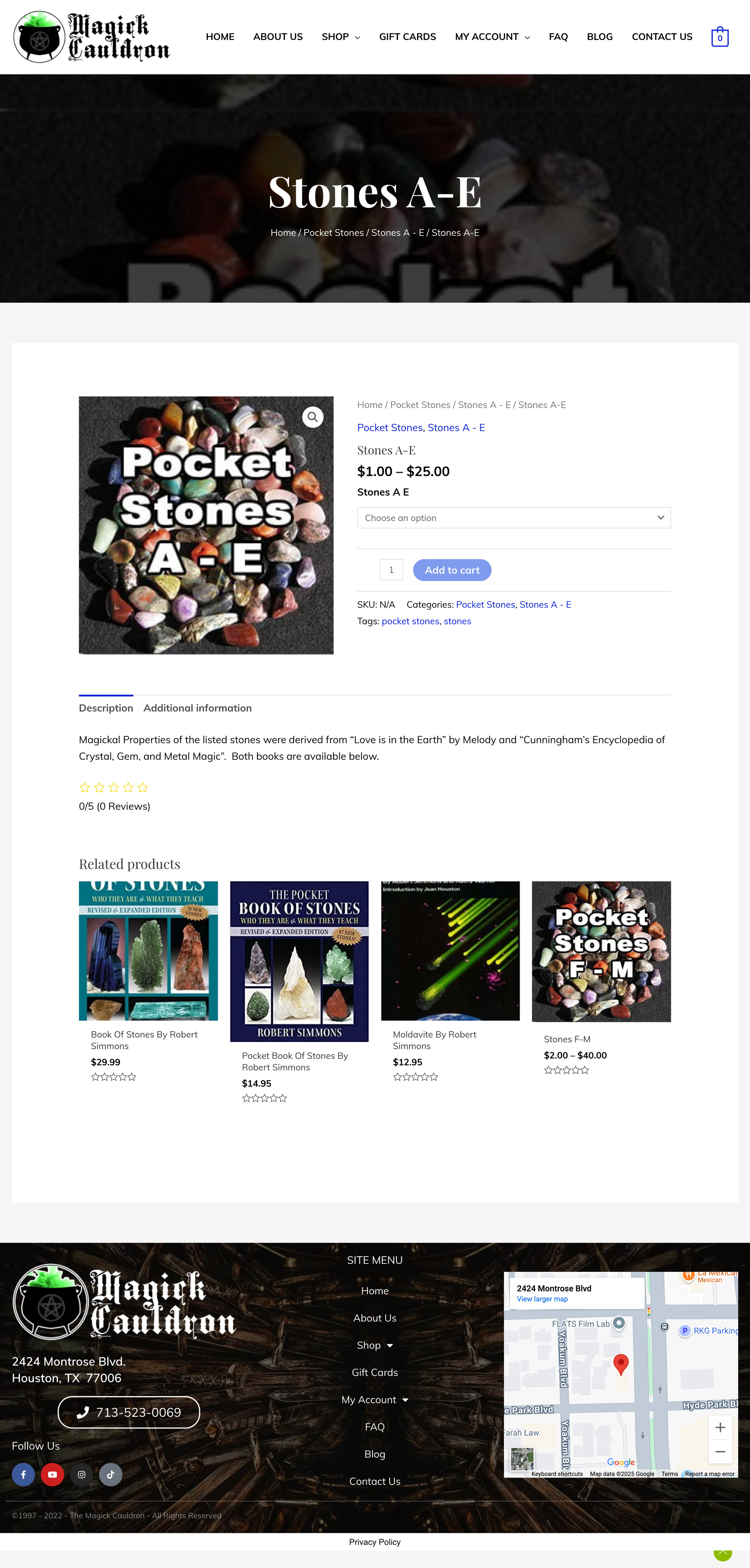
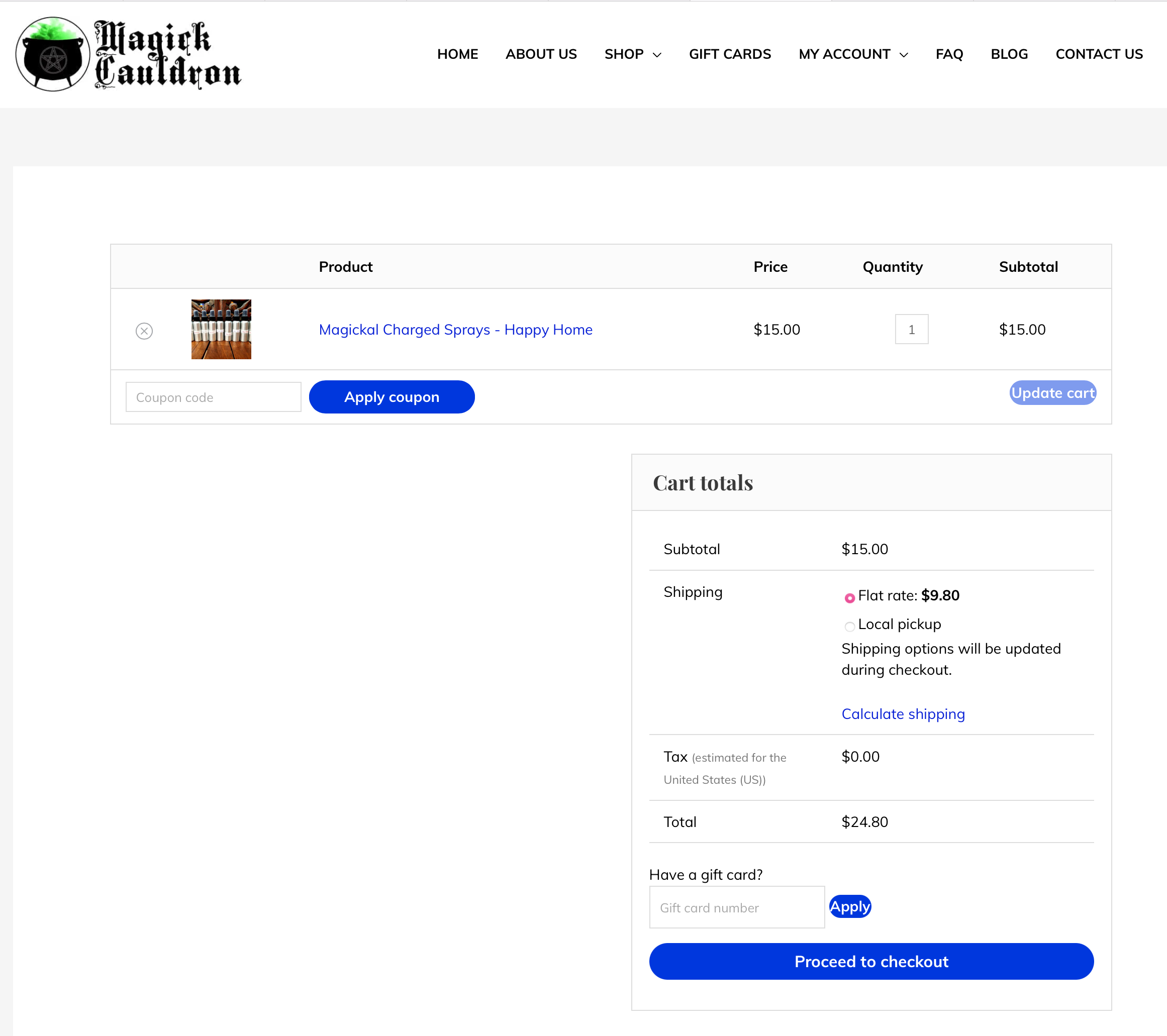
This project focused on redesigning The Magick Cauldron, a local metaphysical shop in Houston that sells crystals, candles, books, and other spiritual tools. The existing e-commerce site had over 20 products but suffered from usability and navigation challenges. My goal was to restructure the site to make it more intuitive, aesthetically aligned with the mystical brand, and accessible for both new and returning customers. As part of my UI/UX bootcamp, this project required me to independently research, design, and test a fully functioning e-commerce prototype.
Timeline (3 Weeks)
Week 1: Interviews, surveys, and research synthesis
Week 2: Feature prioritization, low and mid fidelity prototypes, usability testing
Week 3: High fidelity prototype, final testing, documentation, and presentation
CHALLENGE
The original website overwhelmed users with cluttered layouts, unclear navigation, and missing product details. Users had difficulty finding items, trusting product information, and completing checkout without frustration.
THE SOLUTION
Through my evaluation, three main pain points emerged:
Disorganized navigation created confusion
Product pages lacked clear information (uses, ingredients, reviews)
The cart and checkout process was long, unstructured, not mobile friendly
PROBLEM STATEMENT
How Might We create a simplified, trustworthy, and visually appealing shopping experience that encourages both discovery and purchase?
Design Process
Our team used the double diamond design process to finish this project.
Research 🔎
Heuristic Evaluation of current site
6 User interviews with light usability testing
Affinity Mapping
Competitive Analysis
Feature/Element Comparison
Design 🎨
Mid Fi Wireframes
Mood Board and Style Guide
Hi-Fi Wireframes
Clickable Prototype
Synthesize 🧩
Affinity Mapping
User Proto Persona
User Journey Map
Test ✔️
2 Rounds of Usability Testing
Stakeholder Presentation
Handoff including research report and design files
Ideate 💡
User Flow
Updated Site Map
Sketches
User Interviews
I began with a heuristic evaluation and competitive analysis of other small e-commerce metaphysical shops. Then, I conducted user interviews with people who frequently purchase crystals and candles online. Finally, I tested the original site’s usability to observe where participants struggled.
Key insights included:
Users wanted fewer categories and less clutter on the homepage.
Trust came from clear product descriptions, reviews, and testimonials.
Shoppers appreciated guided paths like “Shop by Intention” to discover items.
A smooth and editable checkout process was essential for reducing cart abandonment.
Affinity Mapping-What did we hear from users?
KEY TAKEAWAYS
Navigation & Findability
Users struggled with long, unclear drop downs
Preferred browsing by intention (e.g., “protection,” “abundance”)
Search didn’t always return expected items
Product Information & Presentation
Descriptions were inconsistent or vague
No usage guidance or customer reviews
Images didn’t always match user expectations
Trust & Checkout Experience
Checkout felt outdated and untrustworthy
Users unsure if payment went through
Visual design affected perceived legitimacy
Mobile Usability & Layout
Layout was hard to navigate on mobile
Buttons/menus were small or difficult to tap
Cart and filters were hard to find
Proto-Persona
Luna Martinez – “The Intentional Seeker”
What This Means for the Design
Social actions must be clear, familiar, and low effort to encourage participation
Music discovery should feel fast and effortless, supporting frequent, everyday use
Insights and stats should be prominent and engaging, reinforcing identity and repeat engagement
Polished visuals and clear hierarchy build trust and reduce hesitation
User Journey Map
What This Means for the Design
• Navigation and categories must be intention based and easy to scan, since confusion appears early in browsing
• Product pages need clear explanations, usage guidance, and trust signals to reduce uncertainty before purchase
• Checkout should be simple and mobile first, as friction peaks during evaluation and purchase
• The experience should reinforce confidence after purchase to encourage repeat buying and emotional satisfaction
Information Architecture-Card Sorting
Most users understood and used the categories correctly
Some items (like pendulums and sprays) caused confusion due to overlapping uses
Clearer product names and optional tags could improve navigation
Overall structure aligns well with user expectations
Sketches-Early Design Concepts
I began with sketches and low fidelity wireframes to test layout options. Mid fidelity prototypes validated navigation structure, and high-fidelity designs brought in branding elements like patterns and typography.
Key design decisions included:
A clean navigation bar replacing overwhelming menus.
Card layouts with spacing for product lists.
Inclusion of testimonials and social media icons to build credibility.
A patterned footer to balance aesthetics with functionality.
Clickable Prototype
Homepage Redesign
Simplified and Clarified Navigation
Shop by Intention
Shop by Category
Product Listing Page Redesign
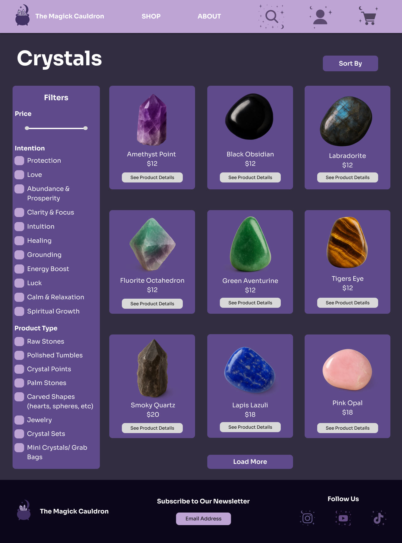
Side Bar with Filters Added
Clear Pictures for Products
Simplified and Clarified Footer
Product Detail Page Redesign
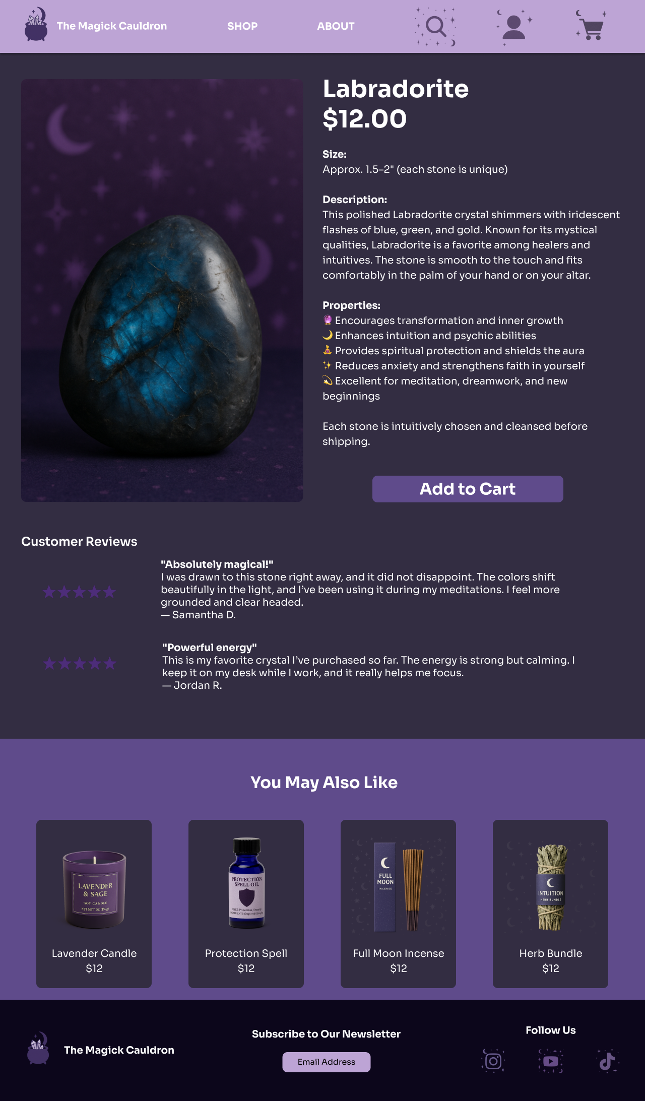
Detailed Photo and Description
Larger CTAS
Cart Page Redesign
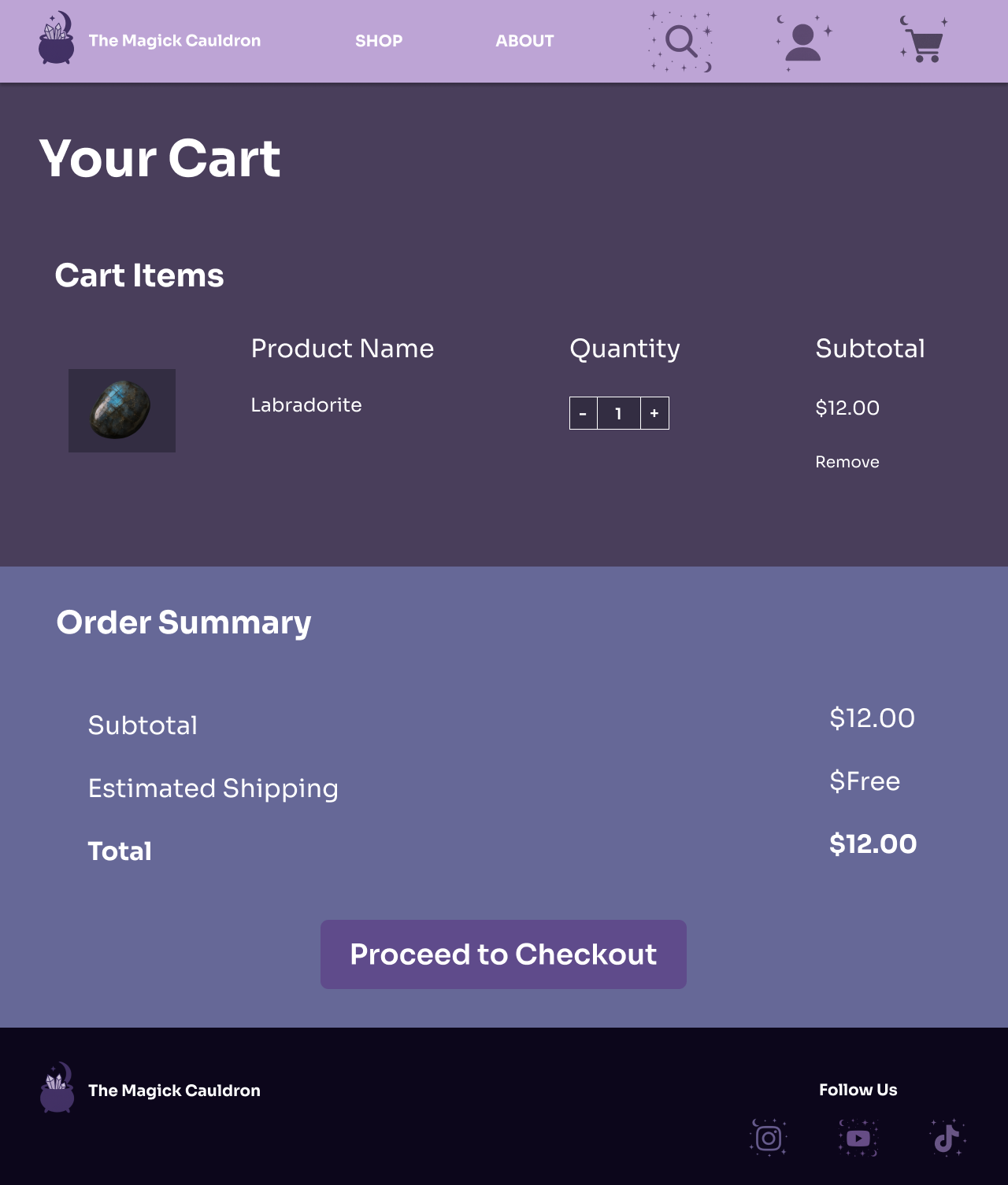
Larger CTAs
Checkout Page Redesign
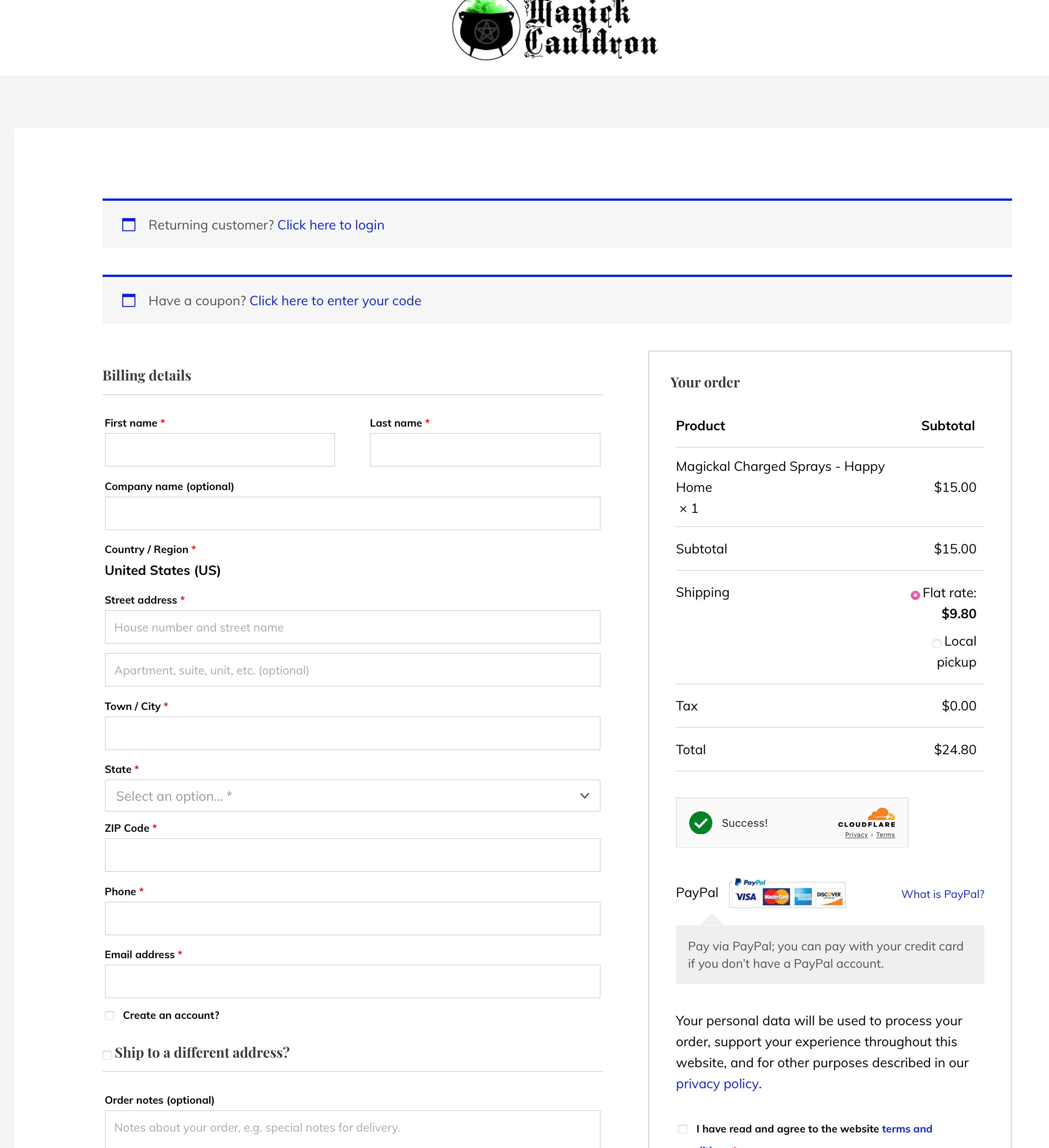
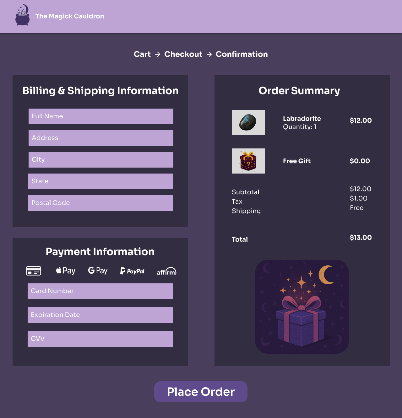
Larger CTA
Product Pictures with Order Summary
Usability Testing
Mid-Fidelity Testing (Round 1)
The mid-fi prototype focused on validating layout structure, navigation clarity, and checkout flow before investing in visuals.
Participants were asked to locate a product, add it to the cart, and complete checkout.
Findings revealed:
Users appreciated the simplified navigation and clear product categories
Some confusion occurred around button hierarchy and the lack of visual feedback in the checkout process
Several participants expected trust elements such as reviews and ingredient details on the product page
Key takeaway: The structure worked, but users needed stronger visual cues and confirmation steps to feel confident completing purchases
High-Fidelity Testing (Round 2)
The hi-fi prototype introduced final branding, imagery, and refined micro-interactions.
Testing verified whether aesthetic elements enhanced or distracted from usability.
Findings showed:
Improved color hierarchy and spacing made call-to-actions clearer
Product pages with reviews and descriptive content increased user trust
Checkout completion time decreased as users understood the process more intuitively
Outcome: The final design balanced clarity with The Magick Cauldron’s magical aesthetic, creating a more trustworthy and efficient shopping experience
Next Steps
If I could develop this design further I would:
Full mobile hi-fi designs for every page
Accessibility audit to meet WCAG standards
A/B testing homepage variations
Expanding the “Shop by Intention” section with curated bundles
Adding a blog or “Learn” section for deeper engagement when time allows